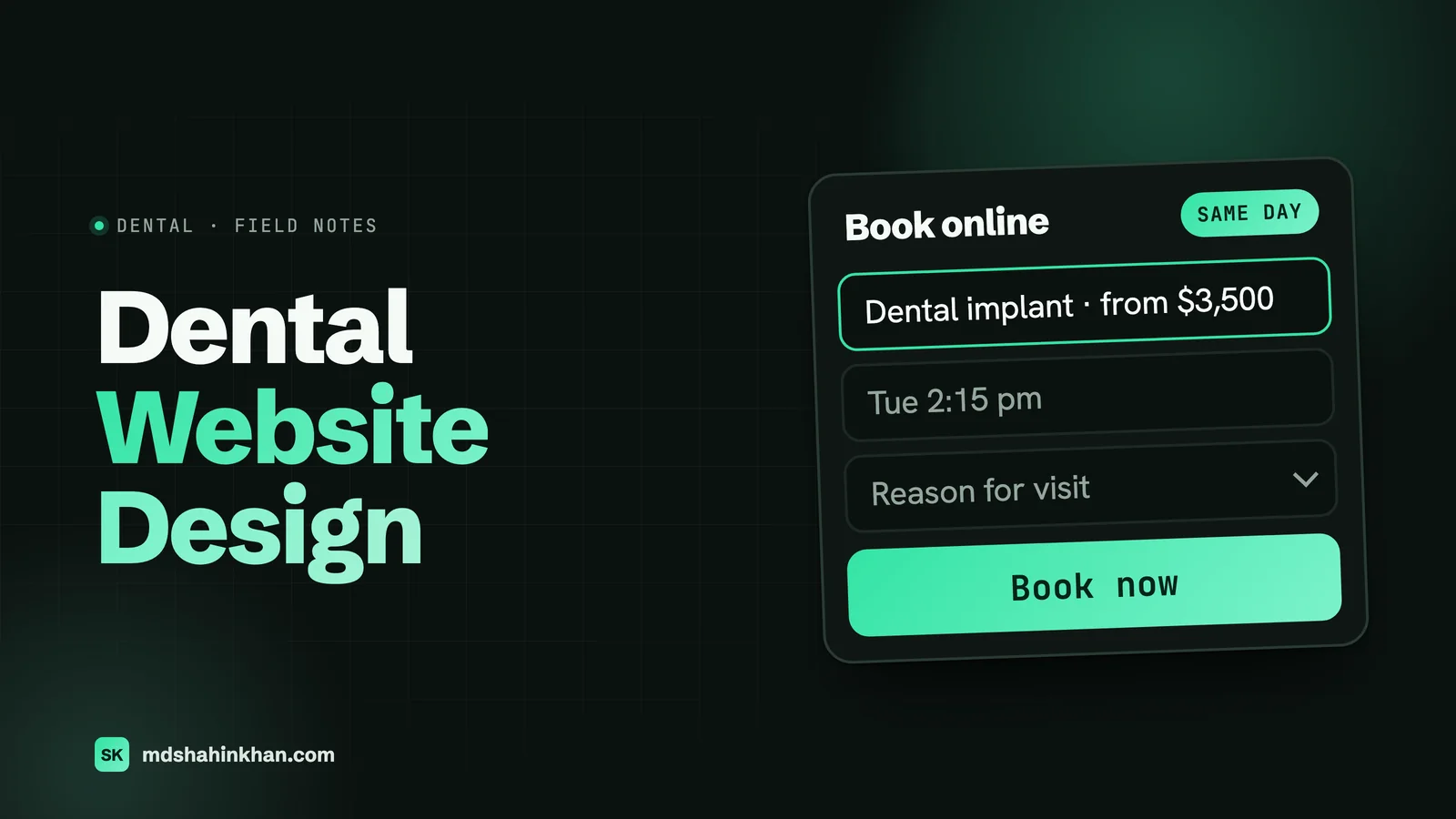
A dental website has one job: to turn a person with a tooth problem, or a person who finally decided to fix their smile, into a booked appointment, on a phone, in under two minutes. The best dental websites are built around that job. The procedure page answers the question the person searched, the phone number and the booking button are tap targets on every screen, the cost page gives real numbers and a financing option, the doctor page shows a person and not a résumé, and the whole thing loads before the person in the car park gives up. Colours and typefaces matter far less than most practices think, and in this guide I show where design matters and where it does not.
I build and rebuild websites for dental practices as a freelance WordPress developer, mostly for US practices through an agency partner and directly. The clearest result I have to show is a dental implant practice whose rebuilt site went from 98 to 7,344 organic visits a month, a 75 times increase, and the site did nothing clever. It did the ten things below properly. Here they are, then what belongs on each page, how booking should work, what HIPAA means for your forms, the speed numbers, what it all costs in 2026, and a checklist for redesigning without losing the rankings you already have.
The One Job of a Dental Practice Website
Three kinds of people land on a practice website, and the site has to serve all three.
- The person in pain. A cracked tooth, an abscess, a child who fell off a bike. They are on a phone, they want the number or the “book now” button, and they want to know you can see them today. If they cannot find either in the first second, they go back to the map results and tap the next practice.
- The researcher. Thinking about implants, Invisalign, veneers, or finally replacing a denture. They read the procedure page, look for a price, check the doctor’s photo and credentials, and read a handful of reviews. They come back two or three times over a few weeks before they book a consultation.
- The switcher. New to town, or unhappy with their current dentist, or a referral from a friend. They want to know you take their insurance, where you park, what the office looks like, and how to become a new patient without a phone call.
Every design decision below serves one of those three people. When a practice asks me for a full-screen video of a waterfall, an animated logo, or a homepage that opens with three paragraphs about “your smile journey”, I ask which of the three it helps. Usually none of them.
Ten Things the Best Dental Websites Get Right
Each of these is testable. Open your own site on a phone and check them in five minutes.
1. A Phone Number and a Booking Button in the Header, on Every Page
The number is wrapped in a tel: link, at least 44 pixels tall, and stays visible while the page scrolls. Next to it sits one button, “Book online” or “Request an appointment”, that goes to a real booking route (more on that below). On phones, a bar with both pinned to the bottom of the screen outperforms anything in the header. On roughly half the practice sites I am handed, the number is plain text, an image, or a link that only works on desktop.
2. One Sentence That Says What, for Whom, and Where
“Family and implant dentistry in Round Rock, Texas. New patients welcome, same-day emergency visits.” That sentence, above the fold, does more than any tagline. A stranger can repeat it back, Google can match it to a search, and the person in pain knows in one second that they are in the right place.
3. One Page per Procedure, Not a “Services” Page With Twelve Paragraphs
Implants, Invisalign, crowns, root canals, emergency dentistry, children’s dentistry: each gets its own page that answers what people actually search: what it is, who it is for, what the visit involves, how long it takes, what it costs or how financing works, and what to do next. The city is in the title. This is also how the page ranks, which I covered in dental SEO.
4. Real Prices, or at Least Real Ranges, and a Financing Option
The most-read page on almost every dental site I have worked on is the cost page, and most practices do not have one. “Call for pricing” on an implant page sends the researcher to the practice that publishes “$3,500 to $5,500 per implant, financing from $120 a month”. Publishing a range does not lock you in; it filters out people who cannot afford the treatment and reassures the ones who can.
5. A Doctor Page That Shows a Person
A real photo taken in the practice in daylight, three sentences in the first person about how the doctor works and what they care about, then the credentials. Patients choose a dentist the way they choose a GP: someone who seems calm, competent, and unlikely to lecture them. Stock photos of a model in scrubs do measurable harm here.
6. Reviews Where the Decision Happens
Live Google reviews with names and dates, placed on the procedure page and next to the booking form, not on a separate “Testimonials” page nobody visits. A total (“4.9 from 312 Google reviews”) near the header and three recent full reviews near the call to action is the pattern that works.
7. Before-and-After Photos With Consent and Context
For cosmetic and implant work, real photos of real patients, with written consent, a one-line description of what was done, and the same angle and lighting before and after. Six good cases beat forty mediocre ones. Never stock, never another practice’s photos, and never photos of minors.
8. New-Patient Information in One Place
Insurance accepted, what to bring, the forms to fill in beforehand, parking, how early to arrive, what a first visit includes, and how the practice handles anxious patients. The switcher reads this page before booking; the practice saves a phone call per new patient.
9. Fast Enough for a Car Park
The site passes Google’s Core Web Vitals on a mid-range phone: the main content paints inside 2.5 seconds, the page responds to taps inside 200 milliseconds, and nothing jumps around while it loads. For a dental site that means images sized for the screen, no video background, one font family, and a host that responds quickly. The numbers are in the speed section below.
10. Accessible by Default
Text at 16 pixels or larger, colour contrast that passes WCAG 2.1 AA, buttons that work from a keyboard, alt text on every image, and forms with real labels. Practices get demand letters over inaccessible websites in the US every year, and the fixes are cheap when they are built in and expensive when they are bolted on.
Page by Page: What Belongs on a Dental Website
A practice with one location needs eight to twelve pages. Each has one job and one action.
| Page | Above the fold | The one action |
|---|---|---|
| Home | What, for whom, where; phone; book button; three procedure tiles; review total | Book or call |
| Procedure page (one per treatment) | The question answered in two sentences; price range or “from”; the doctor who does it | Book a consultation |
| Cost and financing | A table of ranges by procedure; financing partners; insurance list | Apply for financing or book |
| Doctor and team | Photo, three first-person sentences, credentials, a line about how they treat anxious patients | Book with this doctor |
| Reviews | Google total, recent reviews, link to leave one | Book |
| New patients | Insurance, forms, first-visit walk-through, parking, cancellation policy | Download or complete forms |
| Emergency dentistry | “Call now” first, hours, what counts as an emergency, what to do while you wait | Call |
| Location (one per office) | Address, map, hours, phone, photos of the building and the entrance, the doctors at that office | Directions or call |
| Contact | Phone, form, hours, map, a note on reply time | Send or call |
| Blog or guides | One question per article, linked from the procedure pages | Read the related procedure page |
Two things people always ask about this table. First, where is “About us”? Merged into the doctor and team page; nobody wants a page about the practice’s mission. Second, why is the emergency page separate? Because the person in pain searches “emergency dentist near me”, lands there, and needs “Call now” at the top with nothing in the way.
Procedure Pages That Answer the Question
The procedure page is where the researcher decides, so it deserves the most care. A structure that works, in this order:
- The answer. Two or three sentences that say what the treatment is and who it is for, in plain words. “A dental implant replaces a missing tooth with a titanium post and a crown. It is the option we recommend when the tooth cannot be saved and you want something that looks and works like a natural tooth.”
- What the visit involves. Steps, number of appointments, healing time, what it feels like. Specific beats reassuring: “two visits, three to six months of healing between them” beats “a comfortable, easy process”.
- Cost and financing. The range, what changes it, the financing line, the insurance note. Link to the cost page for detail.
- Who does it. The doctor’s photo and one sentence, linking to the doctor page.
- Proof. Two before-and-after cases and two reviews that mention this treatment.
- Questions people ask. Five to eight questions taken from what patients actually ask at the desk, each answered in a few sentences. These are also the questions Google and the AI answer engines pull from.
- Book. The booking button, the phone number, the reply-time promise.
Around 900 to 1,500 words does it. The pages that rank and convert on the implant site I mentioned earlier follow exactly this shape, and the FAQ blocks are where most of the search traffic lands.
The Cost and Financing Page
The practices that publish prices get fewer price-shopping calls and more consultations from people who already know they can afford treatment. A cost page has three parts:
- A table of ranges. One row per procedure, a “from” price or a range, and one line on what moves the number (bone grafting, number of aligners, material of the crown).
- Financing. The partners you use (CareCredit, Sunbit, Cherry, or in-house plans), an example monthly payment, and a link to apply before the visit.
- Insurance. The plans you are in network with, what “we accept” means when you are out of network, and how the practice helps with claims.
If your fees genuinely vary too much to publish, publish the consultation fee and what it includes, and say when the patient gets a written quote. “Contact us for pricing” on every page reads as evasive to the researcher, and the researcher is the person with the $4,000 treatment plan.
Booking That Works on a Phone
There are three booking routes, and the right one depends on the practice, not on the website.
| Route | How it works | Fits | Watch out for |
|---|---|---|---|
| Phone first | “Call now” with the number; the site’s job is to make the call happen | Practices with a strong front desk during office hours; emergency pages | No route outside hours; count the missed calls |
| Request form | Name, phone, email, preferred days, reason; the desk calls back | Most single-location practices; anyone starting out | Promise and keep a reply time; two inboxes plus a text alert on every submission |
| Live scheduler | Real-time slots from the practice software (NexHealth, LocalMed, Weave, Flex Dental, Dentrix Ascend’s own widget) | Practices with the staff to manage a live calendar and the volume to justify $200 to $400 a month | A scheduler that shows no availability is worse than a form; keep the request form as the fallback |
Whichever route you choose, the same rules apply on a phone: the button is in the pinned bottom bar, the form has five fields at most, it works without creating an account, the confirmation says what happens next, and a person replies inside the time the site promised. On a request form I always add a “reason” dropdown (cleaning, pain, cosmetic consult, second opinion, other); it lets the desk call the person in pain first.
One number worth tracking from day one: form submissions and booking clicks against phone calls. On practice sites I have measured this on, roughly a third of after-hours enquiries come through the form or the scheduler, and those are the ones a phone-only site never sees.
Doctors, Team, Reviews, and Before-and-After Photos
Doctor pages. One page per dentist and hygienist who sees patients. Photo taken in the practice, first person, three sentences about approach before any credentials, a line about the treatments they focus on, and a book button. A 40-second video of the doctor explaining what a first visit is like, shot on a phone in good light, lifts these pages more than any professional headshot.
Team page. Front desk and assistants with first names and real photos. The switcher wants to know who will greet them.
Reviews. Pull Google reviews live with a widget, show the total near the header, and show three recent full reviews on every procedure page and next to the form. Reply to every review, including the bad ones, because the reply is what the next patient reads. Do not gate reviews (asking happy patients for Google and unhappy ones for private feedback); Google’s policy forbids it and practices have been penalised.
Before-and-after. Consent form on file for every case, no minors, a one-line description of the treatment, the same angle and lighting, and no editing beyond cropping. Put two cases on the relevant procedure page and the full gallery on its own page. Add a note that results vary; it is both honest and expected.
Location Pages for Practices With More Than One Office
A practice with two or more offices needs one page per office, each with its own address, phone, hours, doctors, photos, embedded map, and a short paragraph about the building and parking. Each page links to its Google Business Profile and the profile links back to it. This is how each office ranks in its own map results, and it is the part multi-location groups most often get wrong by sending every profile to the homepage. The detail is in local SEO for dentists.
HIPAA-Aware Forms and Tracking
This is where practices are most often given bad advice, in both directions. Two rules cover most of it.
A web form becomes health information the moment a patient describes a problem on it. Name plus “I think I need a root canal” is protected health information once it reaches the practice. That has consequences for where the submission goes:
- The form must submit over HTTPS (every site should anyway).
- The submission should not sit in a plain WordPress database, an ordinary email inbox, or a form vendor’s servers unless that vendor has signed a Business Associate Agreement with the practice. Google Workspace and Microsoft 365 offer BAAs; most WordPress form plugins do not store data under one.
- Keep the public request form minimal (name, phone, email, preferred days, reason from a short list) and put medical history, insurance details, and anything with a date of birth in a HIPAA-covered forms tool such as JotForm’s HIPAA plan, IntakeQ, or the intake module of your practice software. Those tools cost $50 to $150 a month and are worth it for this reason alone.
Analytics and ad pixels are fine on public pages and not fine on patient pages. In June 2024 a federal court struck down the part of HHS’s online tracking guidance that treated a visit to a public procedure page as protected information, and HHS withdrew its appeal. The rest of the guidance stands: patient portals, logged-in areas, and any page where a patient submits health details cannot share data with Google Analytics, Meta, or a call-tracking vendor unless that vendor has a BAA. In practice I set analytics on the public site, keep it off the portal and the intake tool, and write down that decision so the practice can show it later.
I am a developer, not a lawyer; a practice with a compliance consultant should run these decisions past them. But these two rules are the ones I have seen practices get wrong, and both are cheap to get right at build time.
Speed: The Three Numbers That Matter
Google measures three things, and a dental site can pass all three without heroics.
| Metric | What it measures | Pass | How a dental site fails it |
|---|---|---|---|
| Largest Contentful Paint | How long until the main image or heading is on screen | Under 2.5 seconds | A 4 MB hero photo, a video background, a slow host |
| Interaction to Next Paint | How quickly the page responds to a tap | Under 200 milliseconds | Chat widgets, review widgets, and booking scripts all loading at once |
| Cumulative Layout Shift | Whether things jump around while loading | Under 0.1 | Images without dimensions, fonts swapping late, a cookie banner pushing content down |
The fixes are the same on every practice site I have sped up: photos exported at the size they display and served as WebP, the hero as a real image rather than a video, one font family loaded once, the chat and review widgets loaded only after the page is interactive, page caching at the host, and a CDN in front of it. A page that passes all three on a phone is the single change most likely to move both rankings and bookings, because the person in pain does not wait.
What a Dental Website Costs in 2026
Prices vary more by who builds the site than by what the practice gets. Two published 2026 guides and my own bands:
| Option | Build | Ongoing | What you get | Source |
|---|---|---|---|---|
| Do it yourself on a site builder | $500 to $1,500 | $20 to $50 a month | Template, basic pages, limited SEO, you own nothing you can move | The Dental Signal, 2026 |
| Freelance WordPress developer | $3,000 to $6,000 | $100 to $200 a month | Custom design, 8 to 12 pages, on-page SEO, mobile-first, you own the site | The Dental Signal, 2026; matches my own bands |
| Dental marketing agency, template or semi-custom | $6,000 to $10,000 | $200 to $350 a month | Photography, SEO setup, scheduling integration, review widgets | The Dental Signal, 2026 |
| Full-service agency, custom | $10,000 to $30,000 and up | $350 to $500 a month plus marketing retainers | Video, content marketing, conversion testing | The Dental Signal and Rosemont Media, 2026 |
| Subscription “website as a service” | $0 to $2,000 setup | $300 to $750 a month | A site you rent; leave and it goes with them | Vendor pricing pages, 2026 |
Line items that get added later, from the same guides: HIPAA-compliant forms $50 to $150 a month, live online scheduling $200 to $400 a month, content updates $100 to $300 a month, and a new-practice content budget of $10,000 to $16,000 if you want every procedure page written professionally from scratch.
My own numbers, for a practice that wants a WordPress site it owns: a single-location practice with 10 to 14 pages, procedure pages written with the practice, a request form, live Google reviews, speed that passes Core Web Vitals, and redirects from the old site runs $3,500 to $7,000 and takes five to eight weeks, most of which is waiting for photos and copy approval. Hosting and care after launch is $60 to $150 a month depending on the host. Live scheduling and HIPAA forms are the vendors’ subscriptions on top.
What should never be in the quote: stock photos of models, a “page count” as the main price driver, an “SEO package” with no deliverables, or a monthly fee for a site you do not own.
Redesigning Without Losing Rankings
Most dental sites I am asked to build are redesigns, and the biggest risk is not the design; it is losing the search traffic the old site has. This is the checklist I work through on every rebuild.
Before the build
- Export every URL on the old site and its traffic for the last twelve months (Search Console and Google Analytics)
- List every page that ranks for anything and note the exact heading and the words that rank
- Save the Google Business Profile links and every citation that points at a deep page
- Record the current Core Web Vitals so you can prove the new site is faster
During the build
- Keep the URL of every ranking page, or write a one-to-one redirect for it
- Keep the content that ranks; improve it, do not replace it with shorter “designed” copy
- Rewrite alt text and titles page by page rather than copying them blindly
- Build the new site on a staging URL that search engines cannot index
Launch day
- Switch DNS, then test the redirect map with a crawler in the first hour
- Submit the new sitemap in Search Console and request indexing on the ten most important pages
- Update the website link on the Google Business Profile, the practice software, insurance directories, and social profiles
- Watch Search Console coverage and the top ten queries daily for two weeks
A redesign done this way usually holds rankings and gains within a month as the speed and content improvements land. A redesign done without a redirect map loses 30 to 60 percent of organic traffic in the first week, and I have been called in to recover more than one of those.
Frequently Asked Questions
How Much Does a Dental Website Cost?
In 2026, a do-it-yourself site on a builder costs $500 to $1,500 plus $20 to $50 a month. A freelance WordPress build for a single-location practice runs $3,000 to $7,000 plus $60 to $200 a month for hosting and care. Dental marketing agencies publish $6,000 to $10,000 for semi-custom and $10,000 to $30,000 and up for custom sites, often with $200 to $500 monthly fees on top. Live scheduling and HIPAA-compliant forms are separate subscriptions of roughly $250 to $550 a month combined.
What Is the 50-40-30 Rule in Dentistry?
It is a cosmetic rule of thumb for how the front teeth should show when a person smiles: the two central incisors take about 50 percent of the visible width, the lateral incisors about 40 percent, and the canines about 30 percent, so the teeth get progressively narrower away from the centre. Some dentists also use “50-40-30” to describe when a damaged tooth needs a crown rather than a filling. It has nothing to do with websites, but if your practice does cosmetic work, a short explanation of it on the veneers page is exactly the kind of question people search.
How to Create a Dental Website?
Decide the procedures you want to be known for and write one page for each, in plain words, with a price range. Write a doctor page in the first person and book a photographer for a morning. Choose a booking route (phone, request form, or live scheduler) and set the reply time you can keep. Then either build it yourself on a site builder, which is cheapest and hardest to move later, or have a developer build it on WordPress so the practice owns it. Add live Google reviews, a new-patient page, and redirects from any old site, and test everything on a phone before launch. Plan five to eight weeks.
What Makes a Good Dental Website?
One that gets a person to book, on a phone, quickly. In practice: a phone number and a booking button on every screen, one sentence that says what and where, one page per procedure with a real price range, a doctor page with a real photo, live reviews next to the call to action, a new-patient page that answers the practical questions, a load time that passes Core Web Vitals, forms that respect HIPAA, and accessibility built in. The visual design should be quiet and consistent; it is the least important item on that list.
How Many Pages Does a Dental Website Need?
A single-location general practice needs eight to twelve: home, one page per main procedure (usually four to six), cost and financing, doctor and team, reviews, new patients, emergency, and contact. Add a location page per additional office and one guide article at a time after launch. Specialist practices (implants, orthodontics, paediatric) need fewer procedure pages and deeper ones.
Should a Dentist List Prices on the Website?
Yes, at least as ranges. Practices that publish “from” prices or ranges get fewer price-shopping calls and more consultations from people who already know they can afford the treatment. Publish the range, what moves it, the financing example, and the insurance list. Where fees genuinely cannot be published, publish the consultation fee and when the patient gets a written quote.
If you want your current site checked against the ten rules, book a free 30-minute call. You leave with a written three-step plan, whether or not we work together. Related: dental SEO, local SEO for dentists, the dental implant case study, what I build for dental practices.