A good law firm website does one job: it turns a person with a legal problem into a phone call or a form submission, on a phone, in under a minute. Everything the best firm sites get right comes from that one job. The practice-area page answers the question the person typed, the phone number is a tap target on every screen, the attorney bio reads like a person and not a résumé, the intake form asks five things and promises a reply time, and the whole page loads before the person in the courthouse hallway gives up. Design in the sense of colours and typefaces matters far less than most firms think, and in this guide I will show you exactly where it matters and where it does not.
I build and rebuild websites for law firms as a freelance WordPress developer, mostly through a US agency partner, and the pattern across those projects is consistent: the firms that win online have quieter sites with sharper pages. Below are the twelve things those sites share, what belongs on each page, the intake form spec I use, the bar rules and accessibility requirements you cannot skip, and what a site costs in 2026, with sources.
What a Law Firm Website Is Actually For
Three kinds of people land on a law firm website, and the site has to serve all three without getting in anyone’s way.
- The person with the urgent problem. Arrested last night, served papers this morning, a crash on the way to work. They are on a phone, they are stressed, and they want a number to call. If the number is not visible in the first second, they tap back and call the next result.
- The researcher. Thinking about a divorce, a will, a business dispute. They read two or three practice-area pages, one bio, and a handful of reviews before they contact anyone. They will come back two or three times over a few weeks.
- The referral checker. A friend or another lawyer gave them your name. They are on the site to confirm you are real, current, and the right kind of lawyer. They look at the bio and the About page and leave.
Every design decision below serves one of those three. When a firm asks me for a slider, an animated logo, or a “modern” homepage with three paragraphs about excellence, the question I ask is which of the three people it helps. The answer is usually none of them.
Twelve Things the Best Law Firm Websites Get Right
These are testable. You can open your own site on a phone and check each one in a minute.
1. One Clear Promise Above the Fold
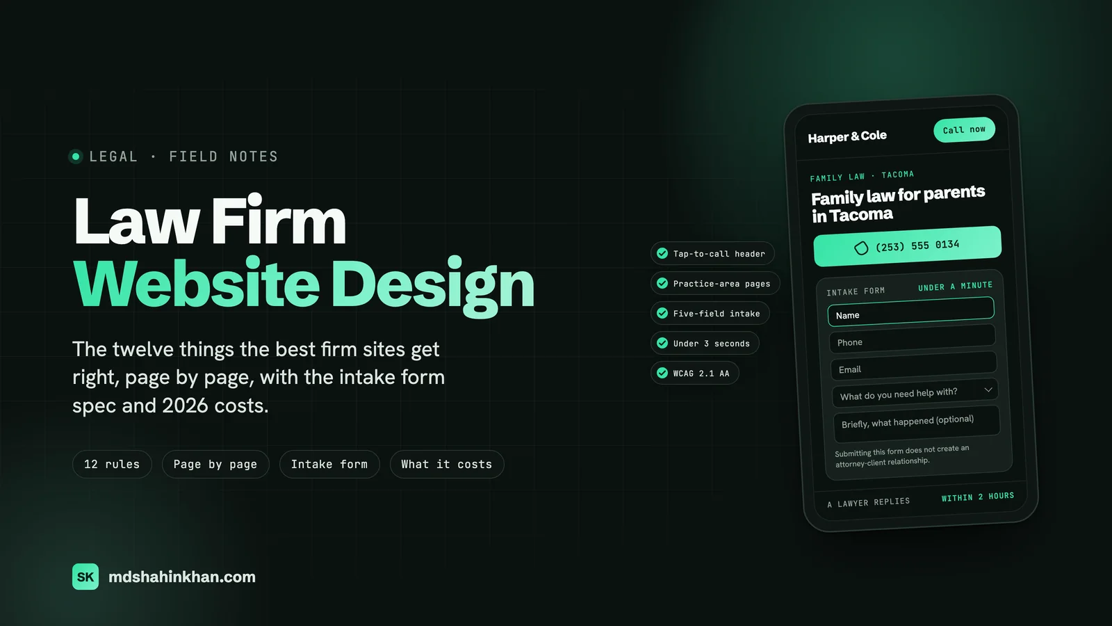
The first screen says what you do, for whom, and where, in one sentence a stranger can repeat back. “Family law for parents in Tacoma” beats “Trusted advocates, proven results” every time, because the second one could be any firm in any city. Under that sentence sits the phone number and one button. Nothing else needs to be above the fold on a phone.
2. A Phone Number That Is a Real Tap Target
The number lives in the header on every page, is wrapped in a tel: link, and is at least 44 pixels tall so a thumb can hit it. On phones it stays visible while the page scrolls, or a call button sits at the bottom of the screen. I check this before anything else on a rebuild, and on roughly half the sites I am handed the number is an image, plain text, or a link that only works on desktop.
3. One Page per Practice Area That Answers the Question
The best sites do not have a “Practice Areas” page with nine paragraphs. They have nine pages, one per matter type, and each page answers what the person actually searched: what the process looks like, how long it takes, what it costs or how fees work, and what to do in the next 24 hours. The city is in the title. This is also the structure that ranks; I wrote it up in detail in SEO for lawyers.
4. Attorney Bios Written for Clients, Not for Other Lawyers
A client reading a bio wants to know three things: have you handled my kind of problem, will you personally handle it, and what are you like to deal with. The best bios open with those and put the law school and the bar admissions at the bottom. A real photo, taken in the office in daylight, does more than any award badge.
5. Proof, Shown With Restraint
Reviews with names and dates, a small number of case results with the facts that made them possible, and the bar or peer badges that mean something. Not twenty badges in a row, not a wall of five-star icons, and nothing that promises an outcome. The proof sits next to the decision point: reviews near the form, results on the practice-area page they relate to.
6. An Intake Form That Takes Under a Minute
Five fields, a confidentiality note, and a stated reply time. The form appears on every practice-area page as well as on Contact. The full spec is further down, because this is the part I see done badly most often.
7. Fast Enough for a Courthouse Hallway
The site loads in under three seconds on a mid-range phone on a weak connection. In practice that means images sized for the screen, no slider, no video background, fonts loaded once, and a host that responds quickly. Core Web Vitals are the measure; a “Good” score on all three is achievable for a law firm site without heroics, and it affects both rankings and whether the stressed person in item one waits.
8. Real Photos of Real People and Places
Stock photos of a gavel, a handshake, or a skyline tell the visitor you are a template. The best sites use photos of the attorneys, the office, the street outside, and the staff at the front desk. One half-day with a local photographer covers every page. This is the single cheapest upgrade with the largest visible effect, and I have never seen a firm regret it.
9. Location Signals a Visitor Can See
The office address, a map, parking or transit notes, and the counties or courts you appear in, on the Contact page and in the footer of every page. This is for the visitor first (is this firm near me?) and for Google second (the same signals feed the map pack). Firms with more than one office get a page per office, each with its own hours and phone number.
10. A Visible “What Happens Next”
After the form or the call, what happens? The best sites say it: “You will hear from a lawyer, not an assistant, within two business hours. The first call is free and lasts about twenty minutes. Bring the paperwork you have.” Removing that uncertainty raises form completions more than any button colour does.
11. Restraint in the Design Itself
Two typefaces at most, one accent colour used only for links and buttons, generous space, and no motion that the visitor did not ask for. The firm sites that look expensive are the quiet ones. Navy and gold with a serif is fine; so is black and white with a sans-serif. What matters is consistency and contrast, and that the button always looks like the button.
12. Accessibility Built In, Not Bolted On
Text that passes contrast checks, headings in order, every form field labelled, every image with alt text, the whole site usable from a keyboard, and no text baked into images. This is WCAG 2.1 AA, it is what ADA web claims are measured against, and a firm that advises clients on compliance should not be the one caught out. The cost of doing it during the build is near zero; the cost of retrofitting is a second build.
Page by Page: What Belongs on Each Page
A small firm needs fewer pages than it thinks, and each page needs to do exactly one thing. This is the spec I hand to the copywriter or the partner who is writing the site.
| Page | The one job | Above the fold | Must include | One action |
|---|---|---|---|---|
| Home | Route the visitor to the right practice area | The one-sentence promise, phone, one button | Practice-area links with one line each, three reviews, the attorneys’ photos, the office address | Call or pick a practice area |
| Practice area (one per matter type) | Answer the question and start the conversation | “[Matter type] lawyer in [City]”, phone, form or button | The process, the timeline, how fees work, what to do now, related results, a bio link, FAQs | Call or submit the form |
| Attorney bio | Make the visitor comfortable with this person | Photo, name, what they handle, phone | Who they help and how, a paragraph in their own voice, credentials at the bottom, reviews that name them | Call or book |
| Results or case studies | Show that similar problems got solved | A short list with the facts that mattered | Matter type, the situation, the outcome, the disclaimer | Read the related practice page |
| Reviews | Concentrate the proof | Count and average, then the reviews | Name, date, source (Google, Avvo), the reply from the firm | Call |
| About the firm | Answer “who are you and how do you work” | A photo of the whole team | How the firm works with clients, fees policy, the office, community ties | Meet the attorneys |
| Contact | Remove every barrier to reaching you | Phone, address, hours, the form | Map, parking, what happens after you contact us, languages | Call or submit |
| Guides or blog | Answer the questions people ask before calling | The answer in the first paragraph | Ten to fifteen evergreen guides, each linking to a practice page | Read the practice page |
Two things firms get wrong here. The first is putting “Practice Areas” in the navigation as a single page and stopping there; the individual pages are where both the rankings and the conversions happen. The second is a blog with 200 short news posts and no guides. Ten guides that answer real questions (“how long does a divorce take in Washington”, “what to do after a car accident that was not your fault”) do more than years of posts about the firm’s new associate.
If you want the words on those pages written to rank as well as convert, the practice-area page template and the ten-guides approach are both in the law firm marketing plan.
The Intake Form: Fields, Order, and the First Hour
The intake form is where most firm websites lose the client they worked to attract. I have seen fourteen-field forms with a “case description” box that demands 200 characters, forms that fail silently on Safari, and forms whose submissions went to a former paralegal’s inbox for eight months. Here is the spec I use.
The fields, in this order:
- Name
- Phone
- What do you need help with? (a short dropdown of your practice areas, plus “Something else”)
- Tell us briefly what happened (optional, a plain text box, no minimum length)
That is the whole form. Everything else, the opposing party’s name, the court date, how you heard about us, belongs in the first conversation, not the form. A conflict check needs the opposing party’s name, and firms often want it on the form for that reason; ask for it on the call instead, because a stranger will not type another person’s name into a website.
Around the fields:
- A one-line note under the form: “Submitting this form does not create an attorney-client relationship. Please do not include confidential details until we have confirmed we can take your matter.” Your bar’s wording may differ; use theirs.
- A stated reply time next to the button: “A lawyer replies within two business hours” is a promise the firm has to keep, so pick one you can.
- The phone number right beside the form, because a third of the people who start a form would rather call once they see the number.
The first hour, which is the part nobody designs:
- The submission goes to at least two inboxes and to a phone as a text message. One inbox is one point of failure.
- An automatic reply goes to the client within a minute, repeating the reply-time promise and giving the phone number.
- Someone is responsible for the reply, by name, and it is measured. The site cannot fix a firm that calls back the next day.
- The form is tested from a phone, in Safari and Chrome, every month, by submitting it. I have found dead forms on sites that had been “working fine” for a year.
Technically, a form like this on WordPress is a native form widget with a spam trap, a stored copy of every submission in the site’s own database, and email delivery through an authenticated sending service so notifications are not silently dropped as spam. That last part is the one most builders skip.
Compliance: Bar Rules, Disclaimers, and Accessibility
I am not a lawyer, and your state bar’s rules govern. But every law firm site I build runs into the same four areas, and a firm should walk in knowing them.
Advertising rules. The ABA Model Rules that matter for a website are 7.1 (no false or misleading communications about the lawyer or the firm’s services), 7.2 (advertising, including the rules on calling yourself a specialist or certified), and 7.3 (solicitation, which touches chat widgets and pop-ups that reach out first). States adopt these with their own variations. New York, for example, requires “Attorney Advertising” on the site, and several states regulate testimonials and past-results claims specifically. The practical rules: never imply an outcome, never call yourself a specialist unless a recognised body certified you, and label testimonials as what they are.
Disclaimers a small firm actually needs. A “no attorney-client relationship” note near every form and in the footer; a results disclaimer next to any case result (“prior results do not guarantee a similar outcome”); a note that the site is general information, not legal advice, on guides and blog posts; and a privacy policy that says what the forms and analytics collect. Keep them short and visible. A 900-word legal page nobody reads does less than one honest sentence in the right place.
Confidentiality. Do not put a live chat or an AI chatbot on the site that invites people to describe their case unless you have decided how those transcripts are stored and who reads them. The same applies to the intake form: no minimum-length “describe your case” boxes, and no form storage in a third-party tool the firm has not vetted.
Accessibility. ADA claims over inaccessible websites are filed against businesses of every size, and law firms are a visible target. Build to WCAG 2.1 AA: colour contrast of at least 4.5 to 1 for body text, headings in logical order, labels on every field, alt text on every meaningful image, keyboard navigation with a visible focus ring, captions on video, and no information carried by colour alone. Test with a free checker and with a keyboard. On a WordPress build this is mostly discipline during the build, not extra cost.
What a Law Firm Website Costs in 2026
The honest answer is that a law firm website costs anywhere from a few hundred dollars to six figures, and the price is driven by who builds it and how many custom page designs it needs, not by how good it is. Here are the bands I see, with sources where they are not my own.
| Route | Typical cost | What you get, and how long it takes | Fits |
|---|---|---|---|
| Do it yourself on a site builder | $200 to $1,000 in the first year (subscription plus a template) | A template with your words and photos. A weekend to a month. | A solo who writes well and has time |
| Freelance developer on WordPress | $3,000 to $8,000 for an 8 to 15 page site, then $50 to $200 a month for hosting and care | Custom pages on the firm’s own site, intake form, tracking, the compliance items above, a site you can edit. 4 to 8 weeks. | Solo and small firms who want ownership without agency pricing |
| Legal-specialist agency, template tier | $3,000 to $5,000 first year (PaperStreet, 2026 pricing) | A themed template, often on the agency’s platform. 1 to 4 weeks. | Firms that want a known vendor and accept less custom work |
| Legal-specialist agency, semi-custom | $9,500 to $15,000 and up (PaperStreet, 2026) | Custom home page on a framework. 6 to 12 weeks. | Small and mid-size firms |
| Legal-specialist agency, custom | $18,000 to $25,000 and up; enterprise $40,000 to $100,000 (PaperStreet, 2026) | Fully custom design, many page templates, branding. 3 to 6 months. | Mid-size and large firms |
For context, Forbes Advisor’s general figure for professionally designed small-business sites, cited in LawPay’s law firm design guide, is $2,000 to $9,000. My own freelance band above sits inside that.
What drives the price up: the number of distinct page designs (not the number of pages), custom photography and video, a migration of hundreds of old blog posts, multiple offices with their own content, and branding work (logo, colours) done alongside the site.
What should not be in the quote: stock photo licences as a line item worth hundreds, a monthly “SEO package” with no defined deliverables, a charge per page for pages that share one template, and a platform fee that means you cannot take the site with you. On that last point, ask one question before you sign anything: “If we leave in two years, do we keep the site, the domain, and the content?” If the answer takes more than one word, keep looking.
Ongoing costs to budget: hosting ($20 to $60 a month for a small firm on a good managed host), a care plan for updates, backups, and small edits ($50 to $200 a month with a freelancer, more with an agency), and a photographer every few years. A $5,000 site that is maintained beats a $25,000 site that is not.
Solo and Small-Firm Websites: Fewer Pages, Same Rules
A solo practice or a two-partner firm does not need a smaller version of a big firm’s site. It needs a different shape.
- Five to eight pages. Home, one page per practice area (usually two to four), one bio or a short team page, reviews, contact. Guides can come later, one a month.
- The attorney is the brand. The home page can lead with the person: photo, promise, phone. People hire a solo because of who they are, so do not hide that behind a firm name that sounds like a partnership.
- The phone matters even more. A solo answers the phone or has a service that does. Say which on the site, and say when.
- Write the pages yourself, then have them edited. Nobody knows the questions clients ask better than the lawyer who answers them. A developer can structure the page; the substance should be yours.
- Budget and time. On the freelance route above, a solo site is at the low end of the band and about four weeks, most of which is waiting for photos and copy. The build itself is the quick part.
The same twelve rules apply. A solo site with a clear promise, a tap-to-call number, three sharp practice pages, a warm bio, and a fast load will outperform a forty-page firm site that has none of those.
WordPress, Squarespace, or a Legal Platform
I build on WordPress, so weigh this accordingly, but the reasoning is the same one I would give a friend.
- Site builders (Squarespace, Wix): the fastest and cheapest way to a respectable solo site if you write your own copy. The limits show up later: intake forms that cannot do what you need, weak control over speed and structure, and a site that lives on their platform. Fine to start; plan to outgrow it.
- Legal-specific platforms: some law firm marketing companies host your site on their own system, with the design, the content, and sometimes the domain under their control. The work can be good, but read the contract for what happens when you leave. I have moved firms off these and it was not always possible to take the content.
- WordPress: the site is yours, it runs anywhere, every form, tracking, and accessibility requirement above is achievable, and any competent developer can maintain it after the one who built it. The cost is that it needs updates and a host that is looked after, which is what the care plan is for. For a firm that intends to be around in ten years, ownership is the deciding factor.
Whatever you choose, the domain must be registered in the firm’s name, with the firm’s own account. I have seen a firm lose its domain to a designer who stopped answering email. It is the one thing that cannot be rebuilt.
How I Would Run the Project in Six Weeks
This is the order that works, whether you hire me, another developer, or do it yourself.
- Week 1: decide the pages and the promise. List the practice areas that bring the money, write the one-sentence promise, pick the phone number and the reply-time promise you can keep. Book the photographer.
- Week 2: write the practice-area pages. One per matter type, answering the four questions: process, timeline, fees, next step. Draft the bio in the attorney’s own words.
- Week 3: build. Templates for the four page types, the intake form wired to two inboxes and a phone, tracking for calls and form submissions, the disclaimers in place.
- Week 4: photos in, content in. Replace every placeholder. Check every page on a phone.
- Week 5: compliance and accessibility pass. Contrast, labels, alt text, keyboard test, bar-rule review of every claim on the site.
- Week 6: launch. Redirects from every old URL if there was an old site, search engines told about the new sitemap, Google Business Profile updated, forms submitted from a phone as a final test, and a calendar reminder to test them again next month.
The law firm page describes what I include in that build, and the fee structure is quoted per project after a call, because the number of practice areas and the state of the old site change it.
Frequently Asked Questions
What Makes a Good Law Firm Website?
One that turns a visitor into a call or a form submission quickly, on a phone. In practice: a one-sentence promise above the fold, a tap-to-call phone number on every page, one page per practice area that answers the client’s actual question, bios written for clients, real photos, an intake form with five fields and a stated reply time, a load time under three seconds, visible location details, the required bar disclaimers, and WCAG 2.1 AA accessibility. The visual design should be quiet and consistent; it is the least important item on that list.
How Much Does a Law Firm Website Cost in 2026?
A do-it-yourself site on a builder costs a few hundred dollars a year. A freelance WordPress build for a solo or small firm runs about $3,000 to $8,000 plus $50 to $200 a month for hosting and care. Legal-specialist agencies publish 2026 pricing of roughly $3,000 to $5,000 for a template site, $9,500 to $15,000 for semi-custom, and $18,000 to $25,000 and up for fully custom, with enterprise sites from $40,000. The price is driven by the number of custom page designs, photography, migrations, and branding, not by quality.
How Can I Build a Website for My Law Firm?
Decide the practice areas and write one page for each, write a bio in your own voice, book a photographer, then either build it yourself on a site builder (cheapest, limited later) or hire a developer to build it on WordPress so you own it. Add a five-field intake form that notifies two inboxes and a phone, put the phone number in the header, add the bar disclaimers and a privacy policy, test it on a phone, and set up redirects from any old site before launch. Plan four to eight weeks, most of it waiting on photos and copy.
How Many Pages Does a Law Firm Website Need?
A solo or small firm needs five to eight: home, one page per practice area, a bio or team page, reviews, and contact. Add guides one at a time after launch. Larger firms add a page per attorney, per office, and per sub-practice, but the rule is the same: one page per thing a client searches for, and no page that exists only to fill the menu.
Should a Law Firm Put Prices on Its Website?
Where the fee is predictable, yes: flat fees for wills, uncontested divorces, business formation, or a stated hourly rate range. Firms that publish them get fewer price-shopping calls and more calls from people who already know they can afford them. Where fees depend on the matter, publish how you charge (contingency percentage, retainer, hourly) and what the first consultation costs, even if the answer is “free”. “Contact us for pricing” on every page reads as evasive to the researcher in item one.
How Long Does It Take to Build a Law Firm Website?
A template site from a legal agency is one to four weeks. A freelance WordPress build for a small firm is four to eight weeks, and the build itself is the short part; photos, copy, and the partners’ review are what set the pace. Custom agency projects run three to six months. If someone promises a full custom site in a week, ask what they are reusing.
If you want your current site checked against the twelve rules, book a free 30-minute call. You leave with a written three-step plan, whether or not we work together. Related: SEO for lawyers, the one-page law firm marketing plan, what I build for law firms.